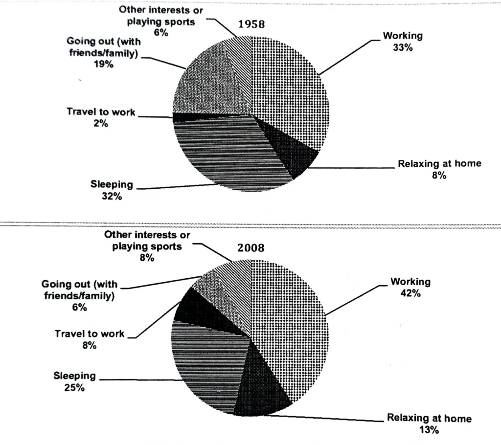
pie chart for working adults
The charts show the percentage of time working adults spent on different activities in a particular country in 1958 and 2008. Summarise the information by selecting and reporting the main features, and make comparisons where relevant.
The information is illustrated in the form of two pie charts, which depict working adults’ daily schedules in a particular nation in the years 1958 and 2008.
In general, people worked longer hours than they slept, and over time, they spent more time unwinding at home and less time going out. In general, spending more time at work and unwinding at home became more common.
1958 saw slightly less time spent sleeping (32%), and nearly one-third of the day was dedicated to work (33%). Attending social gatherings with loved ones accounted for 19% of the activity. Travelling to and from work, engaging in other pastimes, playing sports, and unwinding at home only made up 16% of all the other activities.
There was a 9% increase in working hours and a 7% decrease in sleeping hours in 2008. Travel time to work went from 2% to 8%, a four-fold increase. The amount of time spent going out with friends and family has significantly decreased. It decreased to 6% from 19%. On the other hand, leisure time at home rose from 8% to 13%. The percentage of time spent engaging in sports or other hobbies remained constant at 6% for the two years under consideration.