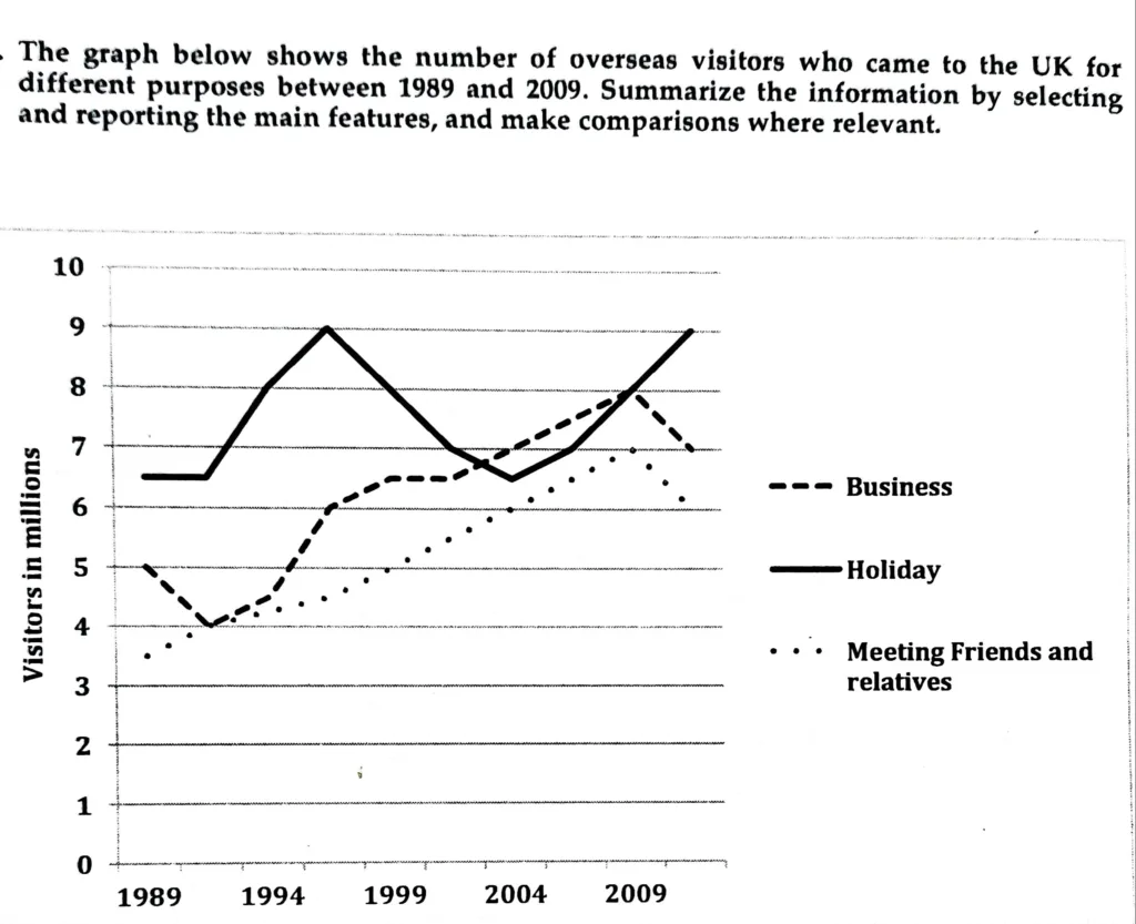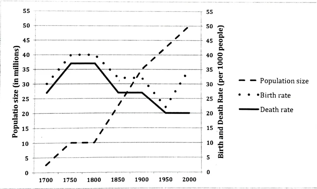
The line graph shows the population size, birth rate, and death rate of England and Wales from 1700 to 2000. Summarize the information by selecting and reporting the main features, and make comparisons where relevant.
The provided line graph compares the birth and mortality rates of Wales and England over a 300-year period beginning in 1700 and shows the population size information. Population size is measured in millions, whereas birth and death rates are calculated per 1000 people.
Altogether, it is clear that while the birth and death rates fluctuated, the population showed an upward trend.
Between 1700 and 1950, there was a similar trend in both the birth and death rates. The birth rate increased from 30 to 40 births per 1000 people, and the death rate increased from 27 to 37 per 1000 people between 1700 and 1750. Both saw periods of stability for the next fifty years, but then a precipitous decline that culminated in an all-time low of about 20 per thousand people by 1950 for both. Between 1850 and 1900, there was once again a levelling off of the birth and death rates. Between 1950 and 2000, the death rate did not change. On the other hand, the birth rate skyrocketed from 22 to 35 per 1,000 people.
Over the course of three centuries, the population increased dramatically, from 2.5 million in 1700 to 50 million in 2000, with a brief interlude of stability between 1750 and 1800.