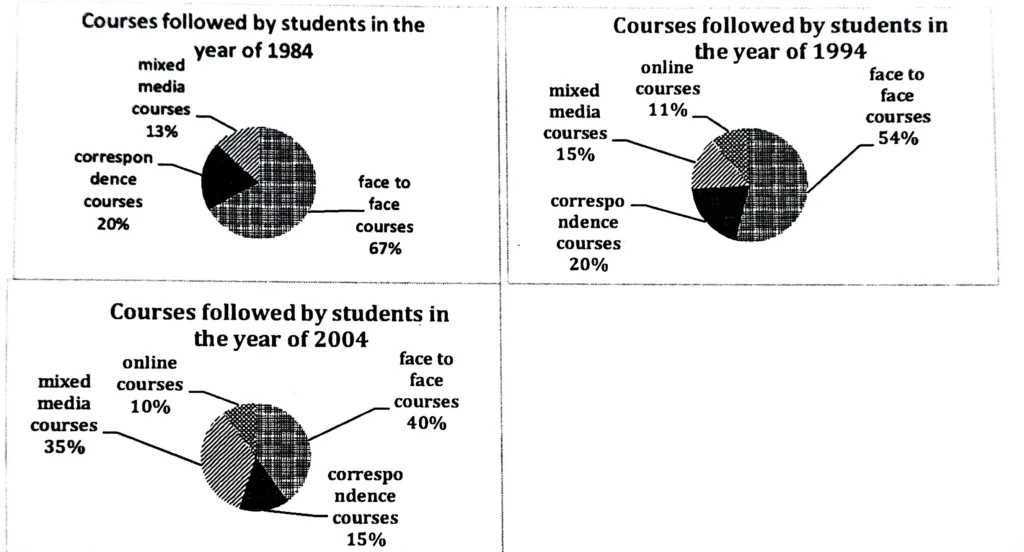
Two charts below show the percentage of qualified graduates in a particular country. Summarize the information by selecting and reporting the main features, and make comparisons where relevant.
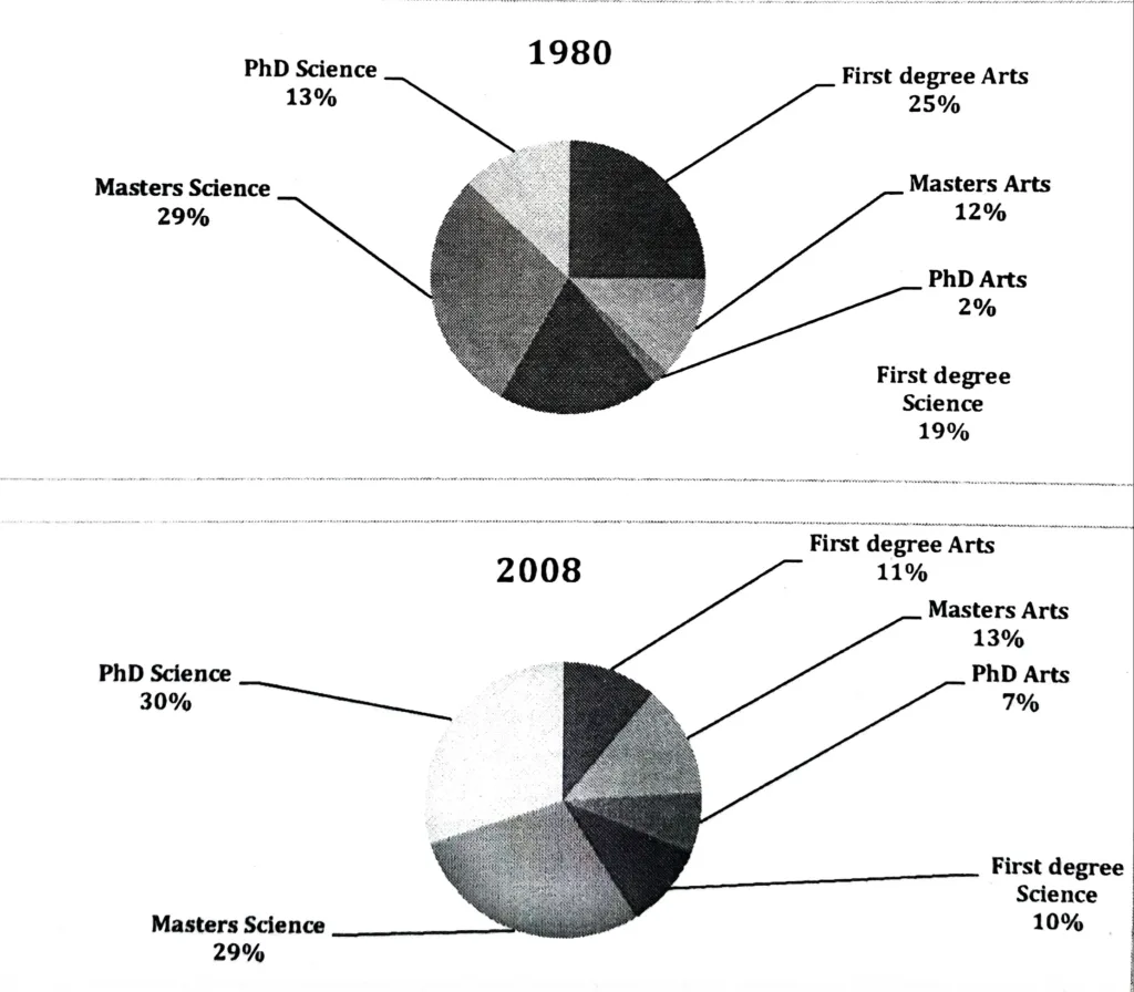
The pie charts show the proportion of graduates with various degrees in each country between 1980 and 2008. According to the charts, first degrees in Arts and Sciences have declined in popularity, whereas Masters and Doctoral programmes have increased in popularity after nearly three decades.
Altogether, it is noticeable that while first degree courses became less popular over time, graduate courses became more popular.
In 1980, 25% of graduates had a first degree in the Arts while only 12% pursued a Masters degree in the Arts, and a very small minority (2%) pursued a PhD in the Arts. First-year science graduates made up just under a fifth of the total, while Masters of Science graduates made up nearly a third. Only 13% were PhD holders.
Graduates with Masters in Arts and Sciences accounted for 11% and 10% of all graduates in 2008. This percentage was significantly lower than in 1958. The proportion of Masters of Arts and Sciences graduates was nearly identical to 1958. PhD holders in the arts increased significantly from 2% to 7%, while PhD holders in science increased from 2% to 30%, both figures significantly higher than in 1958.