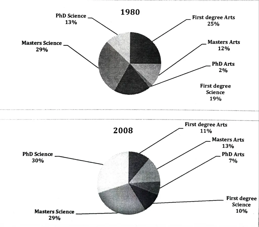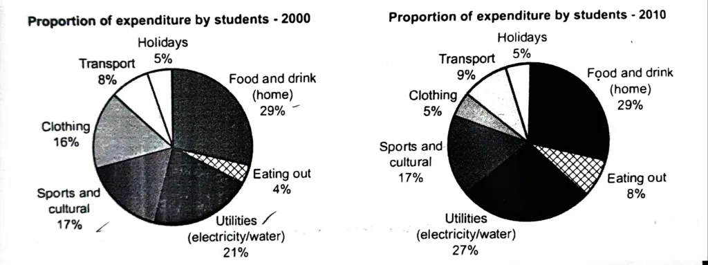
The charts show the proportion of expenditure by students, on average, at one university in 2000 and 2010. Summarise the information by selecting and reporting the main features, and make comparisons where relevant.
The two pie charts compare the proportion of student expenditure in six categories in the years 2000 and 2010. These categories include food and drink at home, utilities, eating out, sports and cultural activities, clothing, transport, and holidays.
In both years, the largest portion of student spending went to food and drink consumed at home, accounting for 29% of total expenditure. Utilities (electricity and water) also formed a significant share, increasing from 21% in 2000 to 27% in 2010. Meanwhile, spending on sports and cultural activities remained unchanged at 17%.
There were some notable shifts in other categories. The amount spent on clothing saw a sharp decline, falling from 16% in 2000 to just 5% in 2010. On the other hand, eating out became more common, with this category doubling from 4% to 8%. Transport costs rose slightly from 8% to 9%, and the proportion spent on holidays stayed constant at 5%.
In conclusion, while student spending priorities on food and utilities remained high or even increased, there was a significant shift away from clothing. Spending in other areas such as eating out and transport showed modest growth, reflecting changing habits and lifestyle choices over the decade.