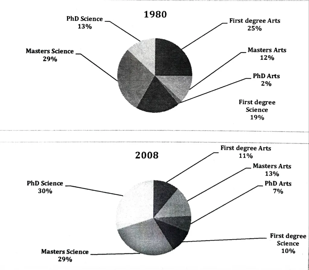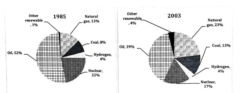
The charts show the proportion of the energy produced from different sources in a country between 1985 and 2003. Summarise the information by selecting and reporting the main features, and make comparisons where relevant.
The two pie charts illustrate the proportion of energy consumption by source in the years 1985 and 2003. The energy sources include oil, natural gas, coal, nuclear, hydrogen, and other renewable sources.
In 1985, oil was by far the most dominant energy source, accounting for 52% of total usage. Nuclear energy came second at 22%, followed by natural gas at 13%. Coal contributed 8%, while hydrogen and other renewable sources made up the smallest portions, at 4% and 1% respectively.
By 2003, oil’s share had declined significantly to 39%, although it remained the leading source. Natural gas experienced a notable increase, rising to 23%, and coal also grew in usage, reaching 13%. In contrast, nuclear power saw a slight decrease to 17%, while hydrogen remained unchanged at 4%. Other renewables increased modestly to 4%.
In conclusion, while oil continued to be the main energy source in both years, its dominance decreased. At the same time, there was a clear trend towards diversification, with increased use of natural gas, coal, and renewable sources.