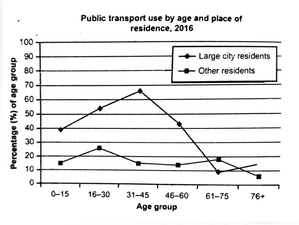
The graph shows information about the use of public transport in one country, by age group and location of residence, in 2016. Summarise the information by selecting and reporting the main features, and make comparisons where relevant.
The line graph clearly demonstrates how the use of public transport varied in 2016 between different ages of citizens of the country in question who lived in large cities and those who did not. The units are measured in percentages.
Overall, all aged residents of metropolitan cities, except 61–75, used more public transport than others in the given year.
Younger and middle-aged people are most affected by the difference between the two groups; among those aged 31 to 45, 66% of city dwellers and only 15% of those outside of major cities use public transport. For kids, the difference was 15% and 39%, respectively, which was less but still significant. But as people got older, the trend shifted: people in large cities who were between the ages of 61 and 75 used public transport at a lower rate (9%) than people in other age groups (18%), although the numbers were the opposite for those in the oldest age group (15% and 6%).
It is noteworthy that there is a greater variation in the percentage of city dwellers across age groups: the youngest has the highest percentage, at 39%, rising to 66% before falling precipitously to a low of 9%. In contrast, the figures for those who live outside of large cities remain relatively stable, with the oldest group’s figure at 6% and the 16–30 year old group’s at 26%.