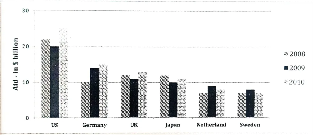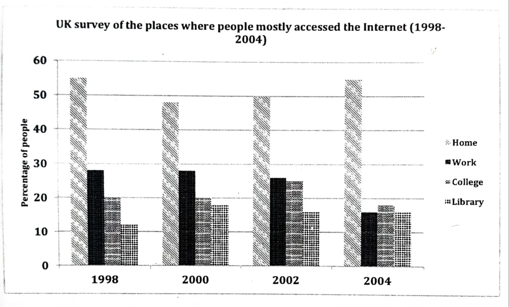
The graph shows the changes in the places where people used to surf the Internet in the years 1998, 2000, 2002, and 2004. Summarize the information by selecting and reporting the main features and make comparisons where relevant.
The provided column graph contrasts different locations where people accessed the Internet from 1998 to 2004. It is evident that during the specified years, the greatest number of people accessed the Internet from home.
In general, there was a significant difference over the course of the four different years between those who browsed the internet from home and those from other locations.
The graph indicates that, compared to colleges and libraries, more people browsed the Internet at home and at work. Between 1998 and 2000, the proportion of people using their homes to access the Internet decreased from roughly 55 to 48. Following that, the percentage increased gradually until it reached 55 in 2004.
The office was the second most popular spot for internet users to visit. From 1998 to 2002, the percentage of people who used the Internet for work ranged from 25% to 30%; however, by 2004, that number had dropped to 15%. In all the years that were given, between 18% and 25% of people used the Internet in college. The least amount of people used libraries to surf the web. This percentage varied over the specified years, ranging from 12% to 18%.