IELTS WRITING TASK 1 – PIE CHART

IELTS WRITING TASK 1 - PIE CHART

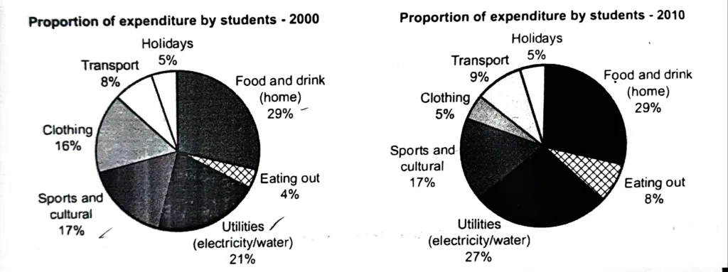
The charts show the proportion of expenditure by students, on average, at one university in 2000 and 2010. Summarise the information by selecting and reporting the main features, and make comparisons where relevant. The two pie charts illustrate the average distribution of student spending across seven categories in one university between 2000 and 2010. Overall, … Read more

IELTS WRITING TASK 1 – PIE CHART

IELTS WRITING TASK 1 - PIE CHART

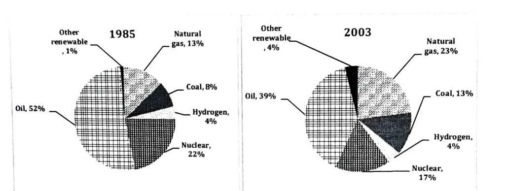
The charts show the proportion of the energy produced from different sources in a country between 1985 and 2003. Summarise the information by selecting and reporting the main features, and make comparisons where relevant. The provided pie charts contrast a country’s energy generation from different sources (natural gas, coal, hydrogen, nuclear, oil and other renewables) … Read more

PIE CHART FOR WORKING ADULTS: ADVANCED BUT EASY IELTS WRITING TASK 1

PIE CHART FOR WORKING ADULTS

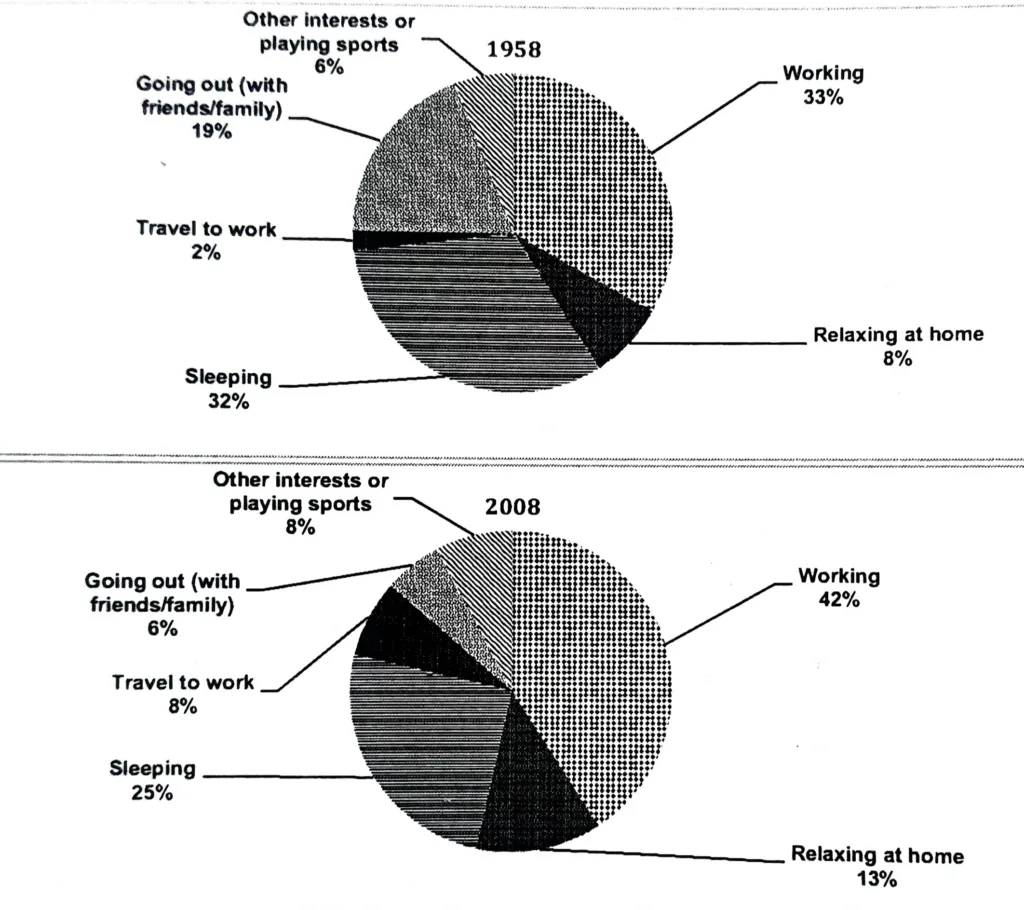
pie chart for working adults The charts show the percentage of time working adults spent on different activities in a particular country in 1958 and 2008. Summarise the information by selecting and reporting the main features, and make comparisons where relevant. The information is illustrated in the form of two pie charts, which depict working … Read more

IELTS WRITING TASK 1 – PIE CHART

IELTS WRITING TASK 1 - PIE CHART

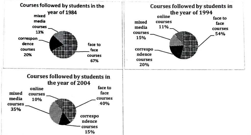
The pie charts below show the different types of courses that were followed by the students during the years 1984, 1994, and 2004. Summarize the information by selecting and reporting the main features, and make comparisons where relevant. The student study courses (mixed-media, correspondence, online, and face-to-face) in 1984, 1994, and 2004 are contrasted in … Read more

IELTS WRITING TASK 1 – PIE CHART

IELTS WRITING TASK 1 - PIE CHART

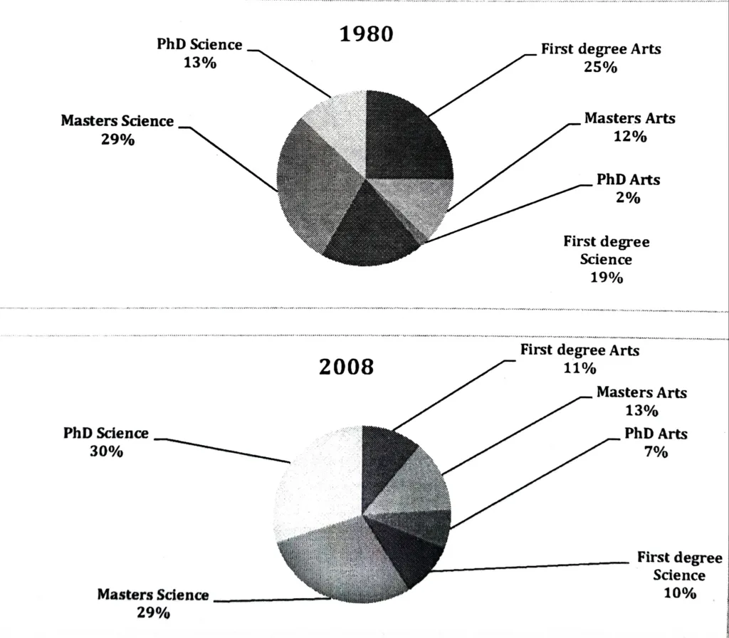
Two charts below show the percentage of qualified graduates in a particular country. Summarize the information by selecting and reporting the main features, and make comparisons where relevant. The pie charts show the proportion of graduates with various degrees in each country between 1980 and 2008. According to the charts, first degrees in Arts and … Read more