IELTS WRITING TASK 1 – LINE GRAPH

IELTS WRITING TASK 1 - LINE GRAPH

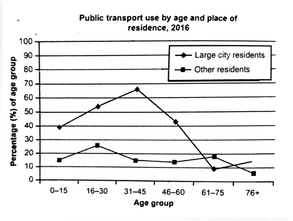
The graph shows information about the use of public transport in one country, by age group and location of residence, in 2016. Summarise the information by selecting and reporting the main features, and make comparisons where relevant. The line graph clearly demonstrates how the use of public transport varied in 2016 between different ages of … Read more

IELTS WRITING TASK 1 – LINE GRAPH

The graph shows the proportion of four different materials that were recycled from 1982 to 2010 in a particular country. Summarise the information by selecting and reporting the main features and make comparisons where relevant. The graph illustrates the percentage of recycled paper and cardboard, glass bottles, aluminium cans, and plastics in a given nation … Read more

IELTS WRITING TASK 1 – LINE GRAPH

The graph shows the spending on research into renewable sources of energy in four countries between 1975 and 2000. Summarise the information by selecting and reporting the main features, and make comparisons where relevant. The provided line graph shows the expenditure trends of four nations on renewable energy research between 1975 and 2000. The data … Read more

IELTS WRITING TASK 1 – LINE GRAPH

The chart below shows three different types of crime in England and Wales from 1970 to 2005. Summarize the information by selecting and reporting the main features, and make comparisons where relevant. Three different categories of breaking the law in England and Wales between 1975 and 2005 are compared in the provided line graph. It … Read more

IELTS WRITING TASK 1 – LINE GRAPH

The line graph shows the population size, birth rate, and death rate of England and Wales from 1700 to 2000. Summarize the information by selecting and reporting the main features, and make comparisons where relevant. The provided line graph compares the birth and mortality rates of Wales and England over a 300-year period beginning in … Read more

IELTS WRITING TASK 1 – LINE GRAPH

The information is illustrated in the form of a line graph about the number of international visitors who travelled to the United Kingdom for business, vacation, or to visit relatives from 1989 to 2009. Units are computed in millions. Altogether, there is an increased tendency in all three motivations for travelling overseas. Specifically, for the … Read more

Exit mobile version