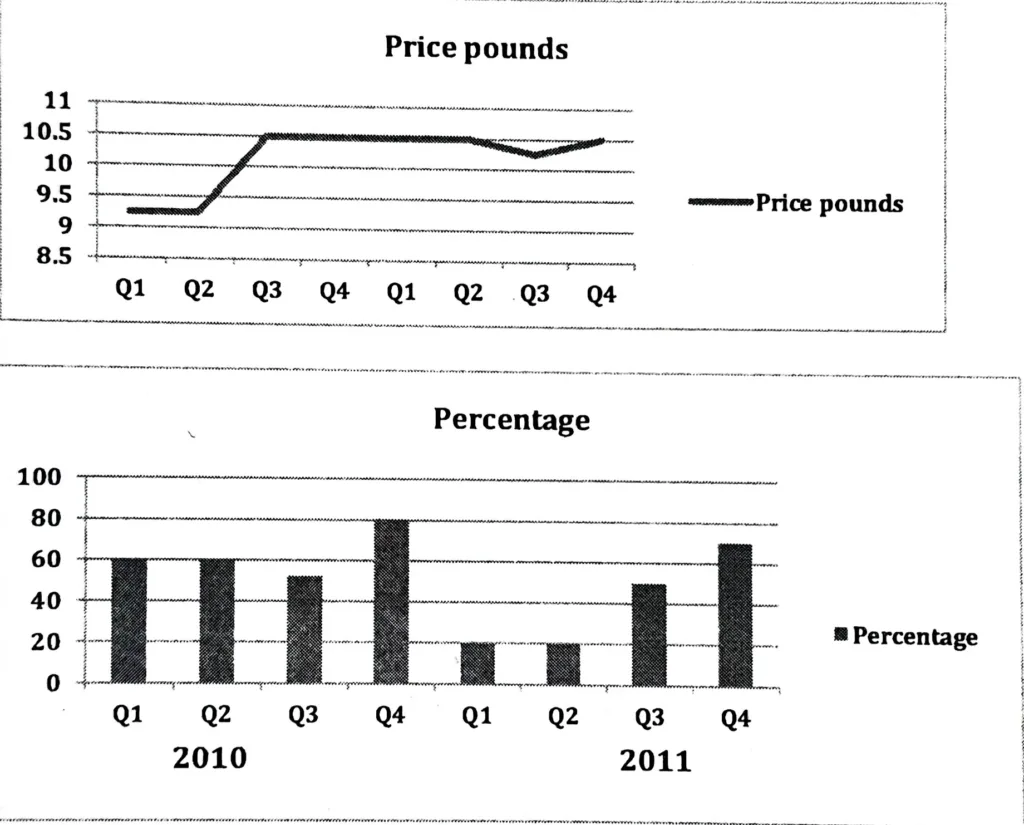
The line graph shows the average prices of tickets sold at a theater, and the bar chart shows the average percentage of tickets sold in 2010 and 2011. Summarise the information by selecting and reporting the main features and make comparisons where relevant.
The line graph and column chart that follow show the percentage of tickets sold in 2010 and 2011 as well as the average price in pounds for theatre tickets in a given quarter. Overall, the charts demonstrate that there was no decline in the proportion of tickets sold in the third quarter of 2010 even with the dramatic increase in ticket prices.
In the first and second quarters of 2010, the average ticket price stayed stable at 9.25 pounds, as shown by the line graph. However, in the third quarter of 2010, there was a significant increase in ticket prices, reaching 10.5 pounds. After that, prices were steady until the second quarter of 2011. Then, in the third quarter, they slightly declined to 10.25 pounds, but they then increased once more, reaching 10.5 pounds in the fourth quarter.
According to the column graph, 60 percent of tickets were sold in the first and second quarters of 2010. The percentage of tickets sold fell slightly (to 50%) in spite of the steep increase in ticket prices. Then, in the fourth quarter of 2010, 80% of tickets were sold, the highest percentage in the eight quarters that followed. In 2011’s QI and Q2, the least amount of tickets were sold; however, by the end of Q4, the percentage of tickets sold had increased to 70%.